Thanks to Spline Bomb, Animschool and Matthew Doble for this little peach. Matthew has been working at Blue Sky for a few years now and is teaching at Animschool! This is a great post regarding weight and how it affects the body, and how much of the body it affects.
Thanks for sharing everyone, enjoy!
03 December, 2012
24 September, 2012
Making It ~Animation Addicts
I am posting this simply as a reminder to myself!! This was posted last week on Animation Addict's Blog and it really struck home with me. It talks about the frustration in trying to get into the animation industry based on certain expectations you had when starting to learn animation. Whether you're currently in school learning animation, or like me 3 years graduated still looking for that full time job as a Character Animator, you should definitely read this! For me it's simple (kind of), I don't spend as much time as I should animating, practicing and getting better. But whatever your reason is, becoming an Animator is hard and takes passion, sacrifice, dedication and perseverance. So read this, motivate and start animating! Oh, and if you haven't been to Animation Addict's Blog yet, go and check it out... there's some great stuff going on there!
___________________________________________________________
 During my last class review at iAnimate
my students showed their frustration with their progression and how
slow it is. It struck me as odd how much pressure is put on animation
students of today. There are a few online schools (I myself teach at the
above mentioned one) and the many CG/Animation colleges and
universities out there. There are a lot of promises out there, and an
expectation that when you complete or graduate from these you’ll be a
qualified feature animator.
During my last class review at iAnimate
my students showed their frustration with their progression and how
slow it is. It struck me as odd how much pressure is put on animation
students of today. There are a few online schools (I myself teach at the
above mentioned one) and the many CG/Animation colleges and
universities out there. There are a lot of promises out there, and an
expectation that when you complete or graduate from these you’ll be a
qualified feature animator.Long ago, when I went to school for traditional animation, it was expected you could/would spend 3 to 5 years either in the clean-up department, then work up to the breakdown inbetweener ranks, before become a fully fledged feature animator. So you would have had time to get comfortable with the animation workflow and pipeline, over time you would have developed your drawing and understanding of timing and spacing. In short, you would have eased into the animator position with a feeling of confidence and experience.
Today you’re expected to graduate, get a job as an animator, and produce the same quality and quantity as any industry professional. Hell, if you take a look at the student reel of some of the best feature animators out there pre-CG, it would look amateure compared with what students are outputting today.
It’s hard and frustrating to watch students who are doing amazing work to get down on themselves because they haven’t hit it big right away. I would say that those, that it takes them longer to achieve their goal, appreciate and cherish it more than those who have no comparison. Animation is one of the hardest thing out there to do well, it’s an art form and like any art form it’s open to interpretation. There are two quotes that I have come across in the past two years, that together sum up what animation is for me and the hardships that we all try to overcome.
The first one is by Bill Tytla at Walt Disney Studios:
There is no particular mystery in animation… It’s really very simple, and like anything that is simple, it is about the hardest thing in the world to doThe second was spoken my way by a co-worker:
Hard work will beat talentThese sum up what we face everyday. My point of view is:
when talent refuses to work.
Don’t get down, keep pushing and practicing. Don’t let yourself get down or complacent, push and keep pushing until you get where you want to go! For some it’s easy, for others it takes a little work. Doesn’t matter how you get there as long as you get there!
18 September, 2012
Creating A Successful Online Portfolio ~Sean Hodge
Alright, this post is a bit long-winded, but I think there are some good and valid points that are totally worth sharing. If you're in an Artistic field whether it's an Animator, Illustrator, Graphic Designer, Digital Painter, Photographer, Web Designer, DJ, or Caterer (you get the idea), you want your website to reflect your artistic ability/style to reach out and grab your audience. That could be a potential client or a potential employer, either way it's a make-or-break type situation. Personally for my website I wanted it nice and simple with easy navigation. After reading this article I may update my site when my new reel is complete (hopefully in early 2013) or I may not. I, for one, like my simplified layout (See #3 below). With that said, I'll stop blabbing so you can get to this mini-book below. I would love to hear your thoughts/comments below.
_________________________________________________________
Your portfolio is the showcase of your work, your skills and your potential for your future employers. The more time and effort you dedicate for a usable and nice-looking design, the higher are your chances for getting better account balance in the end of the month. So how can you make sure your portfolio is better than the portfolios of your competitors? How can you point employer’s attention to your works?
Creating a successful portfolio is easier than you think. Focus on simplicity, ease of use, hitting your objectives, professionally managing the project, and you’ll end up with a successful portfolio. In this article we’ll review 5 pitfalls that commonly plague portfolio design. Then we’ll cover Portfolio Tips that if carefully considered and well executed will deliver quality results for your portfolio.
There are some common mistakes designers make in their portfolios. Let’s review these common pitfalls first to make sure you don’t fall into one of these traps.
Pitfall #1: Obfuscation
Clarity and focus should permeate your portfolio. With language don’t use twenty words when seven will do. Push your best content to the front. When possible place your important content above the fold. Avoid meandering in your language or paths in your website. Keep your portfolio to the minimum of levels deep, while still accomplishing your goals.
Over at Copyblogger there is an article that covers a simple list of writing tips from the man known for cutting out the fluff from writing in the early twentieth century. See the article Ernest Hemingway’s Top 5 Tips for
Writing Well. Hemingway championed using short sentences, strong forceful language, and clarity. All principles that make for effective writing on the Web.

The Portfolio of Evan Eckard is an example of a website that promotes the work from the first page and Gets to it quickly.
In the article Creating The Perfect Portfolio author Collis Ta’eed offers portfolio advice from the perspective of a potential employer. One of his section titled Get to it on the reasons to limit the number of portfolio pieces you have and make finding your best portfolio pieces easy. A potential employer needs to review many potential applicants quickly. You are more likely to make the cut if your best work is promoted prominently. The Portfolio of Evan Eckard is an example of a website that promotes the work from the first page and Gets to it quickly.
Pitfall #2: Information Cramming
There is an issue of wanting to say too much in too little space when creating your portfolio. There is a balance that needs to be achieved with how many pages deep you have users clicking for more information and how much information you try to fit on a page. This is an issue to be aware of when constructing your portfolio.
The tighter you pack your portfolio the more likely it will appear cluttered. If you do need to put a large amount of information on a page see the post Grid and Column Designs over at Web Designer’s wall. It will give you some great ideas on how you can use the grid to your advantage when presenting a vast amount of information.

This article will give you some great ideas on how you can use the grid to your advantage when presenting a vast amount of information.
Pitfall #3: Overdoing It
You’re less likely to go wrong if you keep things simple and organized. You can apply this mindset to all areas of your portfolio. Less is more. The more you try to do in your portfolio the more chances there are for things to go wrong.
If you’re trying to showcase eighteen services you offer you’ll have less success than promoting a few prominently. If you show too many types of work or try to show too much work of any type than you’ll likely to drown the user. They won’t find your prominent pieces that show how great your work is.
Pitfall #4: Uncommon Navigation
Designers have an urge to stand out as unique. The last place to follow this urge is in your site’s navigation. It’s a matter of numbers. If a large number of people coming to see your portfolio will have difficulty navigating through it, your portfolio will fail to meet its goals.
On the blog Astheria in the post My Last Portfolio Sucked, Yours Might Too the author points out some excellent examples of navigation choices to avoid. In this article Kyle Meyer reviews 200 portfolios and points out the problems with using them. Navigation problems made up over 32 percent of the issues encountered.

This article presents some excellent examples of navigation choices to avoid.
Pitfall #5: Visual Clutter
Consider the purpose of any decorative element you bring to your portfolio. If they fit your goals and compliment your work that’s great. Otherwise remove them. White space helps to give a professional feel to your portfolio. The more visual elements you try to push into an area the more difficult it will be to maintain a feeling of professionalism.
Consider visual hierarchy as a way to lead your viewing through the page. At Boxes and Arrows the article Visible Narratives: Understanding Visual Organization explains the principles of visual Hierarchies.

In the interview Where Visual Design Meets Usability – An Interview with Luke Wroblewski, Part II both page hierarchy and visual clutter are addressed. In the article he summarizes some of Edward Tufte’s teachings on avoiding superfluous data.
12 Principles of Effective Portfolio Design
Below you’ll find 12 suggestions which you can use to improve your portfolio or get it right first time when designing from scratch. Please keep in mind that some of these suggestions require patience, time and quite a lot of planning. However, it’s worth it. And the examples provided below show that one can achieve outstanding results with just following these 12 simple rules.
1. Define your Criteria and Strategies for Success
As with any project it will help you to clarify your goals before you begin. Once you know your goals then it will effect every decision you make about creating your portfolio.Below are some common portfolio goals. Also, be aware that often portfolios try to accomplish more than one goal. Or, consider creating more than one portfolio that serves a different purpose.
- The Hire Me Portfolio focuses on getting you a job. If you are actively searching for a job then the current goal of your portfolio is to get hired. In this type of portfolio you can target the work you show to the type of company you want to work for.
- The Sales Generation Portfolio focuses on keeping a flow of work always coming in the door. The goal here is to generate leads. And move potential customers through your sales channel.
- The Reputation Building Portfolio focuses on building your name in the industry and online. This may take the form of an artist’s showcase. Or tie your work together with a blog on your portfolio site.
- The Networking Portfolio focuses on building relationships. There are many networks that have excellent portfolio building tools. They have some advantages to placing your portfolio on their website. Chiefly among them is to leverage the site space for networking.
2. Consider Using Multiple Portfolios
There are multiple reasons to have more than one portfolio. You may have more than one skill set that you would like to promote separately. You may want to create a portfolio that is targeted to landing a specific job and send it to a marketing director at a company. They’ll appreciate that. It saves them time and shows you really want the job. Even if its a one page portfolio.
Even if you are filling the portfolio with the same work you will still benefit by having multiple portfolios within different groups online. Take the case of Nik Ainley, a UK-based designer and illustrator. He has multiple portfolios that all serve complimentary goals. He chose to participate in multiple portfolio-based communities to build his reputation and network with other designers. His website Shiny Binary has received over 1 million visitors.

He has a Portfolio on Behance. He’s involved in numerous groups there and has a large Inner Circle. And it prominently displays that he is available for Freelancing, Long-Term Contract, Full-Time Hire, or Consulting work.

Nick has a very popular Portfolio on DeviantArt. He’s been a member there since 2004. He has over 80 Portfolio pieces and over 1,000 comments on his work there. He has a lot of fans that have his works marked as favorites.

He is less active though he does have a Gallery on CPLUV. His Portfolio on Depthcore is really good. This site features artists that have to be invited to contribute. So, the quality of work on this site is really high.

Overall Nik Ainley shows how you can benefit from having multiple portfolios online even when the work you are showcasing is similar in each portfolio. That is because you are taping into a different community with each portfolio you create. You’re meeting people, exposing them to your work, and making new connections by placing your portfolio within different communities.
Some portfolio communities to look at:
3. Target Your Market
The more you target your design to a specific market the more it will speak to the visitor within that market. If you are looking to land corporate clients in a conservative industry than present them with work that is clean, marketable, and looks successful. Don’t showcase edgy, grungy, or arty work unless that’s the market you’re going after.
In the article The Secret to Getting a Lot of Web Design Work the author has a section “Design the portfolio you think your clients want to see”. This is the point. Make your portfolio focused on your target market. If you’re trying to get clients then design keeping these clients in mind.
There are more benefits outlined to targeting a specific market. In the article Finding a Target Market the author Barbara Pellow discusses both Vertical and Horizontal Approaches to target marketing. She identifies some of the additional benefits of target marketing. Speaking to a specific audience allows you to become a recognized expert in the field easier. Targeting your market can differentiate your services.
Consider this example: a web designer that specializes in designer Law Firm websites has a different target market than a company that builds Rock Band websites. The language, graphics, and approach sch portfolios take will differ greatly. If a web designer has numerous successful Law Firm websites in their portfolio it will make it easier for a potential law firm client to choose them over another designer or design agency.

A designer is more likely to stand out by targeting a specific market. Their success rate at landing jobs in a specific niche and being perceived as an expert in that area will increase. Take a look at the Dan Gilroy Design Portfolio for an example of a website that successfully targets a specific market.
Having a target market in mind is essential to choosing your portfolio pieces and your approach to designing your website.
4. Make Usability a Top Priority
Navigation is a top consideration as a user being able to view your portfolio is of paramount importance. See the point about Uncommon Navigation above. Some other considerations are using web standards. This is especially true if you’re looking for a job as a web designer today. Read this article Five steps to a better design portfolio by Jefferey Veen. In it he discusses some issues around best practices in your portfolio in relation to how you will be perceived by a potential employer.
Also, don’t discount the search bots. Work toward better Search Engine Optimization. The blog at SEOBook is a rich resource on this topic. Good SEO will improve the ability for potential clients to find you through the major search engines.
5. Utilize the Right Technology
If there are technologies inherent in your job description then it may make sense to build your portfolio with that technology. Sure Flash is cool, but is it right for your website. Probably not if you’re a logo designer. Though if you’re trying to land a job as a Flash Designer at a top notch Interactive Design Agency like Story Worldwide than its the right choice.
The New Media Designer Portfolio of Mathew V. Robinson presents an easy to use navigation. Essential to the success of a Flash site, it’s fast loading. His portfolio is highly usable and looks great.

Consider maintainability when deciding on technologies. Simplifying your portfolio as much as possible will ease the time you’ll have to spend on upgrading or making changes to the website. You should consider how easy it is to add and remove portfolio pieces.
The easier it is the more likely it is you’ll update your portfolio on a regular basis. Jamie Gregory has an simple, elegant, and effective one page portfolio. He would have no trouble adding or swapping out pieces from this portfolio.

Consider enhancement when looking at technology. Often a wise choice is to add a little Javascript or other technologies rather than rely on them. It can help you to achieve your goals without overly complicating your portfolio design. When visiting Marius Roosendaal’s Portfolio take a moment to explore how clean the source code is. This is done while providing elegant Javascript-based solutions.

Choose between creating a static site or utilizing a CMS (Content Management System). One page portfolios are really easy to update and a good way to quickly show your best work. You’ll also have no issues with navigation, as there is only one page. Though there is little flexibility there and you’re not leveraging some additional features that content management systems have for promoting your work, like having a blog.
6. Plan Your Portfolio Project
One of the key ingredients to creating a successful portfolio is to approach it like you would a client project. Manage this project as professionally as you would any other web project you take on. Set aside the time needed to achieve the goals you’ve outlined for the portfolio. Make sure you set up deadlines so that you have key targets to hit.
7. Narrow the Scope and Type of Work Promoted
Your portfolio should be limited to the best work you will promote within the scope of your goals. If you are taking on website redesigns then your portfolio should consist only of that, not logo designs or print work that you’ve done. If its not the work you’re targeting than don’t include it. You will be more successful.
Jesse Bennett-Chamberlain redesigned his website 31three.com back in May of 2007. Before doing so he used to have print and logo designs in his portfolio. In the redesign he clarified his target market by focusing on assisting developers with design. His current portfolio only presents website and interface designs he has created because that is the type of work he is looking for. This portfolio is very successful on many points and has been referenced in many articles throughout the blogosphere.

That doesn’t mean he doesn’t do logo or identity design. He does do that, but he’s recognized that logo design is not why people come to him. They come to him for website designs for new or existing sites and logo design may be a part of the package. See more about his process at this article Redesigning the ExpressionEngine Site.
Certainly some designers or firms will have mixed bag portfolios. The more types of work you do successfully the greater challenge you’ll have in promoting that work. When possible keep the work on display to a minimum. Displaying 10 of your best pieces of work is often better than displaying 50 good pieces.
8. Provide Adequate Contact Information, Documentation, and Explanations
Contact information should be easy to find and in the case of contact forms they should be easy to use. Prominently place this kind of information. The Hicksdesign Portfolio has contact information displayed well on every page.

It helps to build confidence with your target market to clarify your role in the projects you present in your portfolio. If you designed the website, but someone else coded it, then state that. If you did everything then confidently declare that as well.
The Portfolio of Cameron Moll employs this strategy on each portfolio piece.

Providing case studies gives a deeper view into your process. Once a potential employer or client has narrowed down their list they may come back and start to take more time with your portfolio. Case studies will show how competent and thorough your process is. David Airey does a good job of providing easy to find case studies on his portfolio pieces.

Client testimonials are effective for persuading those that visit your site that you will deliver on your promises. It increases the level of professionalism when tastefully incorporating testimonial into your portfolio. David Airey has an article titled The Importance of Client Testimonials that has useful information on this subject.
9. Present Your Work Within the Confines of Your Goals
Your work needs to stand out foremost in your portfolio. If your portfolio site design overpowers the work on display then you’re not likely to meet your site goals. Consider carefully every visual element you add to the design. When unsure shoot for simplicity.
10. Infuse Your Personality Into Your Design
Nick La has a portfolio design that shows his design style and interests. The unique background illustration stands out. It doesn’t interfere with the usability of the site, but it gives it a beautiful wrapper. For some this would be to much and interfere with the work being presented. Though the work presented in his portfolio works fine. He sets the portfolio pieces against a solid white background in a strong column-based design. The work presented fits with the style of the sites background illustration. Pulling off this kind of personal infusion into the design of your site is difficult to achieve.
Doing this well makes your portfolio not only memorable but remarkable! Nick La achieved tremendous success with his portfolio for N.design Studio. Being remarkable in the design of your portfolio often means bringing to fruition the personal design taste unique to you that has been cultivated over the years.

Seth Goden has some excellent points about being remarkable in his post How to be remarkable. Here is a quote from the post “Remarkability lies in the edges. The biggest, fastest, slowest, richest, easiest, most difficult.” This is a good point, but there is a huge risk involved in that pursuing the remarkable edge you ride right off the cliff.
Carefully consider how you will blend your remarkable personal elements into your portfolio without sacrificing usability and without misaligning the balance between the prominence of your portfolio and the design of the site itself.
11. Promote and Leverage Your Work
There are many techniques for promoting your portfolio. Consider joining professional online communities and networking with other community members. We’ve already looked at some communities that you can place a portfolio on. Place a thread in a design forum about your portfolio. Submit your design to gallery websites. Almost any technique that can be used to promote a website can be used to promote your portfolio.
Add a blog to your website. The more traffic you can pull to your website the more exposure your portfolio will receive. Dan Cederholm was an early adopter of this technique and achieved fame with his blog Simplebits. His portfolio resides successfully on the same site.

Leveraging your work involves linking to it when you send emails. Include a link to your portfolio site in your Facebook profile or any other community you belong to. Infuse your portfolio site within your communications and your online identity.
12. Develop Your Long-Term Portfolio Goals
It always helps to have a view toward the future. Your portfolio needs are likely to change many times as you develop different projects over the course of your career. Though even looking at the whole of 2008 and not only at the next week can make a big difference in the choices you make when creating your portfolio.
Putting it all together: a successful portfolio finds that perfect blend of your personality, prominence of work, simplicity, and ease of use that makes your portfolio stand out from the crowd and achieve your goals.
11 July, 2012
A Little Inspiration Goes A Long Way!
If you're following this Blog, chances are you are an Animator in some degree or another. One thing that I'm finding on this crazy adventure of learning this awesome art form is that whatever physical, mental or emotional reason you may encounter from time to time you get frustrated or just completely burned out where you don't feel like going on.
Lately, this has been me, I've been mustering up the motivation to get working on some shots for a new demo reel. Maybe because it's summer or maybe because I just finished a slue of various side projects, but I just couldn't get the ball rolling....
One of the major influences that contribute to most Animators getting inspired is seeing other fantastic work coming from both students and professionals. Cruising the interwebs, as of late, I've been seeing all the trailers for the new animated features coming out, plus watching a lot of student work and short films that are full of awesome. This plays a major role and has always helped me in the past (and still does, I guess it's all so intimidating), but hasn't had the same effect on me as it did when starting out Animation Mentor. So here is a personal example of unexpected inspiration. Last week, I was out at the local watering hole for my birthday. Now keep in mind, when I'm out and about I'm always networking in some degree or another. I met someone who was a Motion Graphic Artist/Animator for a Denver News Channel. Instantly we started 'geeking out' and talking shop. With modern day technology we were able to show each others' demo reels via our smart phones. He was impressed with mine, as I was his. Thinking back on it, hearing that positive feedback is what I think was the spark I needed to get my butt in gear to make the best demo reel that I can. "The Golden Reel" as I refer to it, the one that's going to get me that full time job as a Character Animator. I guess what I'm getting at, is that inspiration comes in all different forms, you may not realize it at the time, but it's all over the place and it will hit you when you least expect it.
Here is some inspirational animation goodness to maybe light that spark you've been looking for.... enjoy!
_____________________________________________________________
Drive me!! from manitou on Vimeo.
Jeff Gabor- Rio Annie Reel Submission from jeff gabor on Vimeo.
Pixar Internship Reel Summer 2011 from Justin Farris on Vimeo.
09 July, 2012
Workflow eBook (free) ~Animation Insiders
If you've been following this Blog, you'll notice an over-abundance of workflow posts... I'm a big advocate for workflow. Why? You ask. I don't know, maybe it's because after you get to a certain skill level when becoming an Animator (with some level of confidence) is usually around the time you have nailed down, in some form or another, a consistent workflow which helps you get the best quality animation in the most efficient amount of time. If you're in the Animation Industry, you are well aware that there are always deadlines and Directors that needed your animation yesterday! I believe that mastering your workflow is how you accomplish this.
Thanks to the Twitter machine, I found a blog called Animation Books Reviews. It's a new blog and talks about.... well, animation books. It looks as if it's just starting out (only a few reviews so far), but it looks like it's going to be another great tool, so make sure you go and check it out. On it, there was a post about a free eBook on workflow from some totally awesomely-radical-inspiring Animators.... I haven't read it all yet, but the review was enough to get me to download it, and did I mention IT'S FREEEEE!! You obviously have an internet connection, so get over there and download it!!
Thanks Animation Book Reviews and Animation Insiders!!! You rock!
__________________________________________________________
DOWNLOAD ANIMATION INSIDERS !
06 July, 2012
Arc Tracker for Maya 2012 ~Spencer Jones
Tired of wondering if your animation is flat and stale... well, no more!! Spencer Jones just finished up with a new arc tracking tool for Maya 2012. Spencer is an Animation Mentor Alumni and currently works at Rockstar Games North in Scotland (there's a link to his demo reel just above). There's a link below to download... you should check it out and use it on your next animation, get those super sweet arcs that look so rad!! Thanks a ton Spencer!
_________________________________________________________________________
- Track an objects motion (Auto updates. Uses Maya Motion Trails)
- Track with thorough option (Does not auto update. Slow but thorough)
- Track timeline range or override with custom range
- Change colours for path, keyframes, in-betweens
- Show Keyframe or all frame numbers
- Toggle Xray draw
- Zoom controls for active camera/viewport
- Attach To option for moving cameras (Temporarily disabled)
- Dockable UI
DOWNLOAD IT!
25 June, 2012
Ten Mistakes ~Travis Howe
I've decided to try something new for this post and am hoping to continue it on a fairly regular basis. I'm going to round up some inspiring and amazing Animators who are the bees' knees to stop by and drop some knowledge, experiences, insights or tips they've found useful over their years while working in the animation industry.
For those of you who don't already know, let me introduce Mr. Travis Howe. I was lucky enough to meet Travis at Animation Mentor's Graduation Ceremony back in early 2010 (after stalking him for some time on the AM school site)... He's an absolute phenomenal animator with brilliant timing, weight and body mechanics and superb acting shots. He has been nice enough to come by and share some of his personal experiences with us on this crazy industry in the world of animation. He's a fellow Animation Mentor Alumnus, an excellent artist, a fellow Blogger and just an overall awesome dude! Currently Travis is working on Sly Cooper: Thieves of Time @ Sanzaru Games in California. Check out his demo reel below! Thanks again Travis for all of your insights and sharing your personal experiences in the animation industry.
_________________________________________________________________
1). Work Regular, Reasonable Hours!
The Mistake: When I was attending Ex'pression College from 2004-2006, I had a reputation for being at the school more than any other student. I wasn't known as the hardest worker, or the best animator, or the most serious student. I was just the guy that never left his desk. I'd work for 16 hours straight, sleep for 4, work 18 more, sleep 6 more. I was not on any sort of cycle. Some weeks I'd never see daylight, some weeks I'd never see night fall. It completely messed up my psychosis. I think I lost my mind a bit while I was in school, honestly. I was burned out, which resulted in many other mistakes (namely, #2 on this list), and did some of the lousiest, most discombobulated work that school has probably ever seen. This sleep deprivation I put myself through remains the single biggest regret of my professional life.
5). Don’t Talk Trash!
The Mistake: About five years ago, I started my first game-studio animation gig at what was then called Secret Level, before its name was changed to Sega Studios, SF, before it went under. I was the “young gun,” the rookie animator on a team full of experienced, extremely talented animators. It was daunting, to say the least. Not wanting to seem “out of my element,” I put on a lot of bravado when I was around them. One day, we decided to go to lunch with the other animation team (Secret Level had two projects at the time: Golden Axe and Iron Man. Fun Fact: both were put on Virgin Media’s Top 10 Worst Games of 2008 list). While we waited for our food, I decided to tell an amusing anecdote about “the worst reel I’ve ever seen.” It had come in to the cell phone media studio I’d worked for prior to Secret Level, and had become something of a joke between the artists – the kind of joke only an insecure person would find amusing. In any case, I described this reel in full detail, laughing the whole time, and not understanding why my coworkers didn’t find it as hysterical as I did. Instead, an awkward silence hovered around the table. As we walked back to the studio, one of the animators took me aside. It turns out, the reel I was describing was the reel of one of the animators with whom I was sharing this story.
The Lesson: You might not end up at Pixar right away, but use that time to learn everything you can, and to grow not only as an artist but as a human being. I have met countless artists in my relatively short time in the industry. I've discussed with many of them the topic of "paying your dues," and every one of them looks back on the rough years, the patchy gigs at shady studios and short term contracts on projects no one would ever see, with a sense of pride in how far they've come. I'll talk more about that in my final point. Let's just let that simmer a bit, shall we? Smashing!
7). Don't Make Animation Your Every Thought
The Mistake: So you've got a poster of My Neighbor Totoro hanging in your living room? A desk covered in cool Japanese toys? Every book on the subject of animation that's ever been written? Good for you, but that does not make you an animator. When I was at Ex'pression, I felt that if I wasn't living, eating, and breathing this stuff, then I wasn't serious about it. I started wearing Hawaiian shirts on a regular basis, trying to fit that John Lasseter mold. However, instead of going out and seeing the world around me, spending time observing human behaviors, I spent most of my time geeking out about the subject of animation itself. I think this greatly hindered my early animation education, because I spent more time informing my brain with Pixar behind-the-scenes videos than actually getting out there and taking in the thing animation is meant to reflect: real life experience!
10). Love the Ride!
My name is Travis Howe. I’m an animator for Sanzaru Games, where I’ve done a large portion of the playable character animations for Sly Cooper: Thieves in Time. When Jason asked me to contribute to his wonderful blog, I spent a long time thinking of advice and interesting stories from my experiences in the animation and game industries. The more I dug through my experiences in an attempt to find something valuable to share, the more I realized: I’ve screwed up a LOT! I’m very grateful to say that my stupidities have not prevailed, and that I have found mercy and help along the way to save me from myself. However, I do feel that many of my mistakes can serve as cautionary tales to others heading down the same path and into this incredible, exhilarating career. Eleanor Roosevelt once said, “Learn from the mistakes of others. You can’t live long enough to make them all yourself.” With that in mind, I’ve put together a list of ten mistakes I’ve made, and what you might learn from them.
1). Work Regular, Reasonable Hours!
The Mistake: When I was attending Ex'pression College from 2004-2006, I had a reputation for being at the school more than any other student. I wasn't known as the hardest worker, or the best animator, or the most serious student. I was just the guy that never left his desk. I'd work for 16 hours straight, sleep for 4, work 18 more, sleep 6 more. I was not on any sort of cycle. Some weeks I'd never see daylight, some weeks I'd never see night fall. It completely messed up my psychosis. I think I lost my mind a bit while I was in school, honestly. I was burned out, which resulted in many other mistakes (namely, #2 on this list), and did some of the lousiest, most discombobulated work that school has probably ever seen. This sleep deprivation I put myself through remains the single biggest regret of my professional life.
The Lesson: Rest up! Don't overdo it! Take the time to go
home and fall asleep to your favorite movie, or read a book, or go out with
your friends. You'll have your crunch periods and 24 hour binge animation
marathons, but do not get yourself into a routine of working more than 12
hours a day. That is the single best piece of advice I can give to
animation students.
2). Relax. Don't panic!
The Mistake: While attending Ex'pression, I had a mentor at Pixar. He always seemed to be so worn when I saw him, as though I was the obnoxious nephew he promised his sister he'd watch while she was in traffic court. It wasn't until years later, when I was working full time at Sega, that I finally understood why. I went to have lunch with him on a day I had off. I was relaxed, level-headed, and was thinking of my former mentor as an old friend rather than as a "Pixar god". During our lunch, he said something I'll never forget. He said, "Well, Travis, it seems like you're over your crisis." My crisis? I hadn't realized that while I was panicking about being a professional animator, I was actually giving off the impression that I was losing my mind. Instead of calmly learning to swim, I was tensing up and clinging desperately to those who already knew how.
The Lesson: When a child is
learning to swim, the biggest mistake they can make (besides flat-out inhaling
underwater) is to tense up. Why? Because they'll sink! It's the
same in animation: when you're first learning this tremendously difficult
trade, it's so easy to feel that gut wrenching panic! "Why am I not
improving?" "How am I ever going to do this with people expecting
good work from me on a daily basis?"
These questions used to haunt me. During my college years, I woke
up in a cold sweat on a regular basis. It’s
natural to feel this panic, but talk to someone about it – a mentor or a
trusted friend who can relate to your situation. Don’t do as I did and keep it inside, always
showing your “brave face,” because it might not be as convincing as you
think.
3). Don't Just Accept Criticism; Seek It Out!
The Mistake: Recently, I was working on a shot for Sly Cooper, a sort of hyper-shortened IGC (in-game cinematic) for Carmelita Fox. I had gotten rather far with it before seeking any feedback, and in fact, when I did so, it was more of an attempt to show the shot off, rather than to garner useful critique. Well, the co-worker to whom I showed it responded rather negatively. I snapped at them – in person, then via IM when they tried to apologize – and then continued on with my shot. A while later, I realized they were right, made the alterations, and very sheepishly apologized. [For the full account, read this: Blog].
The Lesson: Animation is a
very tough field, because it is both technical, which makes it hard to execute,
and artistic, which makes it subjective. Because of this, you can put a
TON of hard work into something people won't "get", but will likely
be markedly difficult to change. When that happens, the immediate, gut
reaction is to feel defensive. Instead, think of it this way: when
someone gives an instant, perhaps unsolicited opinion of your shot, it's really
a blessing in disguise! That person may be saving you from shipping
that animation in a form to which a million people will respond the same way.
Therefore, seek out criticism, as early as possible. Find people
whose opinions you trust (not people who always give you favorable responses --
in fact those people are no help at all), and get their eyes on your shot.
Trust me, you'll not only be a better animator this way, but a more
respected one as well.
4). Don't Be Married to Your Work
4). Don't Be Married to Your Work
The Mistake: Recently, I had a full
set of animations on Sly almost completely axed. My initial impulse was
to defend these animations; after all, they're some of my favorites I've done
on the project. I told my lead I felt these animations had a lot of
personality and added a lot to the aesthetic of the area to which they were
applied. He responded, first, that it's a gameplay issue (these
animations were relatively long for what they were, and therefore slowed
gameplay a bit). Secondly, he said that, as my role on Sly has been
player-character centric, 80% of the time the player is looking at my work, so
stop whining. Thirdly, and most applicably to this lesson, the IGC animators
have been working just as hard (or harder), and have had work cut, changed, and
re-recorded far more than I have, but that's "the nature of the
beast".
The Lesson: Once you have feedback,
it's very easy to feel so attached to your work that you only half-apply the
notes that are given. I have definitely been guilty of this. Don't
be afraid to remove full sections, return to blocking, whatever you need to do
to get the shot working. Additionally, remember that, at least in the
professional world, it's not your project.
Be ready – as a professional, your favorite work WILL be cut from time
to time. Try to show some dignity when
the time comes!
5). Don’t Talk Trash!
The Mistake: About five years ago, I started my first game-studio animation gig at what was then called Secret Level, before its name was changed to Sega Studios, SF, before it went under. I was the “young gun,” the rookie animator on a team full of experienced, extremely talented animators. It was daunting, to say the least. Not wanting to seem “out of my element,” I put on a lot of bravado when I was around them. One day, we decided to go to lunch with the other animation team (Secret Level had two projects at the time: Golden Axe and Iron Man. Fun Fact: both were put on Virgin Media’s Top 10 Worst Games of 2008 list). While we waited for our food, I decided to tell an amusing anecdote about “the worst reel I’ve ever seen.” It had come in to the cell phone media studio I’d worked for prior to Secret Level, and had become something of a joke between the artists – the kind of joke only an insecure person would find amusing. In any case, I described this reel in full detail, laughing the whole time, and not understanding why my coworkers didn’t find it as hysterical as I did. Instead, an awkward silence hovered around the table. As we walked back to the studio, one of the animators took me aside. It turns out, the reel I was describing was the reel of one of the animators with whom I was sharing this story.
The Lesson: The lesson here
is not “don’t talk trash because you might be sitting with the person of whom
you are talking.” The odds on such an
occurrence are pretty extreme. Rather,
it’s simply unprofessional – not to mention flat-out bad manners – to talk
negatively about other professionals. I
was eventually able to smooth things over with the animator in question, and in
fact we worked quite well together when eventually placed on the same
team. However, such arrogance and
rudeness can seriously harm your career.
You want to maintain a good reputation and be well respected. And if “being a good human being” is not
enough incentive for you, consider this:
the next time you’re searching for work, if the email goes out around
the studio, "Hey, we're hiring. Anyone got a recommendation?" you
should be the guy (or gal) that pops into their greedy little
referral-bonus-seeking brain.
6). Prepare to Pay Your Dues
The Mistake: I am of the mindset that “things happen for a reason.” When I came out of Ex’pression college, I was... well, pretty full of myself. I genuinely felt that every rejection letter I received was a failure on their part to see my potential. I mentioned in a previous note that it took me over a year and a half to finally land a decent animation gig. I think, perhaps, I had to go through that eighteen months of stagnancy in order to see that I was not God’s gift to the animation industry. I think I grew more during that time than any other time in my life, because I realized that I wasn’t “owed” a job at [insert favorite major film studio here]. I was forced to spend my time “in the trenches.”
The Lesson: You might not end up at Pixar right away, but use that time to learn everything you can, and to grow not only as an artist but as a human being. I have met countless artists in my relatively short time in the industry. I've discussed with many of them the topic of "paying your dues," and every one of them looks back on the rough years, the patchy gigs at shady studios and short term contracts on projects no one would ever see, with a sense of pride in how far they've come. I'll talk more about that in my final point. Let's just let that simmer a bit, shall we? Smashing!
7). Don't Make Animation Your Every Thought
The Mistake: So you've got a poster of My Neighbor Totoro hanging in your living room? A desk covered in cool Japanese toys? Every book on the subject of animation that's ever been written? Good for you, but that does not make you an animator. When I was at Ex'pression, I felt that if I wasn't living, eating, and breathing this stuff, then I wasn't serious about it. I started wearing Hawaiian shirts on a regular basis, trying to fit that John Lasseter mold. However, instead of going out and seeing the world around me, spending time observing human behaviors, I spent most of my time geeking out about the subject of animation itself. I think this greatly hindered my early animation education, because I spent more time informing my brain with Pixar behind-the-scenes videos than actually getting out there and taking in the thing animation is meant to reflect: real life experience!
The Lesson: It's so awesome to be
enthusiastic about animation, and animators, and animation studios. It's
what got you motivated to start educating yourself on the subject. That
enthusiasm will be the driving force that powers you through the many sleepless
nights it will take to master this complex craft. I encourage you,
however, to live your life, and to celebrate your other interests. For
some, it might be a sport; for others, maybe it's a road trip with friends.
For me, it's time with my family. Animation is meant to reflect
life, our thoughts, our experiences. It isn't supposed to envelop them.
8). Don't Be Overly Ambitious
The Mistake: I have many faults, but as an animator, biting off more than I can chew is definitely my biggest one. Case in point: for my first ever dialogue piece, I was required to animate a minimum of one character doing a minimum of 10 seconds of dialogue. I chose a 30 second piece that required four characters. Fast forward six years to when I was doing my final dialogue piece at Animation Mentor. I'd learned by this point that being overly ambitious will get me into trouble. But knowing a bad idea and avoiding a bad idea are two very different things. I chose this musical bit with two people drunkenly singing "Benny and the Jets" while she's laying against him and he's got his arm around her and she's toying with his fingers and WHAT WAS I THINKING??? It's the biggest regret of my time at Animation Mentor, that I didn't do something mindlessly simple and knock it out of the park. No, instead I had to show off, never complete this ridiculous piece of complex messiness, and not have a useable bit of dialogue for my demo reel. It still pains me to think about.
The Lesson: Don't be like me: old and full of regrets at the
student reel I could have had if only I'd practiced what I preached and
"Kept It Simple, Stupid." Okay, well I’m not
“old,” and I wouldn’t say I’m “full of regrets,” as my current job is exactly
what I never knew I always wanted, but I certainly do wish I’d done a simpler
piece. Take every piece you attempt in
stride. It’s so tempting when you get a
great idea in your head to just go gung-ho on it, trying to impress people with
the complexity of your work. Instead,
the next time you’re working on a shot, consider the idea that the simplest
form of it may actually be the most appealing, and it will certainly be the
form most likely to get completed.
9). Ideas are EVERYTHING (or, Finish What You Started):
9). Ideas are EVERYTHING (or, Finish What You Started):
The Mistake: After a few missteps
in pre-production on my Ex’pression demo reel, I was forced to start from
scratch. The new idea was simple, yet
unfortunately not a “complete” idea. I’d
determined that, as an animator, what I really needed was a reel chock full of
animation tests. I came up with a
“short” that didn’t really have an ending, and wasn’t particularly cohesive as
a narrative at all. It essentially found
my character navigating an obstacle course – a great opportunity for some body
mechanics exercises. I never finished
it, but rather polished up the “most useful bits,” and started sending it
around. Meanwhile, a friend of mine (an “unofficial
mentor” is perhaps a better term) was working hard at a major studio, on a
project he was extremely excited about, but couldn’t talk about. He contacted me and asked me to send him my
work. I did so, and it turns out they
quite liked it, but unfortunately, because this was for the pre-viz department,
they were looking for more complete narratives. I didn’t find out until a while later that
the project I had missed out on due to my neglect to finish what I started was
a little film called Avatar.
The Lesson: This one really
pained me for a long time. I retrace my
steps and wonder what I would do differently, and the answer is quite simple –
I would complete what I’d begun. It
might not have been the best narrative, but at the very least it would have
been a finished piece, which as far as I can gather, was the main reason I
missed this opportunity.
10). Love the Ride!
The Mistake: Writing
all of this down has forced me to really dig into my memories, and I’ve become
quite nostalgic in the process. Nearly
12 years ago, I was dry-heaving on the side of I-5. It was about 10 at night, drizzling rain, and
I was on my way back from a family trip to Los Angeles. Along the way, we had stopped at Cal Arts, a
school that I had been told was the only means of achieving my dream of working
at Pixar. At the time, this was mostly
true. Pixar was rather picky about who
they hired, and where they came from. They
have since opened their doors much wider, but around the turn of the century, a
student from Cal Arts was certainly more likely to get Lasseter’s eye. I was dry-heaving on the side of the freeway
because it had become transparently clear that Cal Arts was not going to
be an option for me. I feel like from
that horrendous moment, I can fast-forward through 12 years full of schools and
studios, let-downs and triumphs, to the moment I’m writing this. If I could go back to that 17 year old kid
trembling on the side of the highway, I would tell him, “Pixar, Cal Arts, none of that
matters. You are going to have a rough
road, but you’re going to love it!” I
look back at all of these experiences with so much pride, and even more so,
excitement for what the future holds.
The Lesson: Don’t have tunnel
vision toward your end goal; look around at where you are at now, even if it’s
working at Target, or living in your parents’ basement while you chip away at
your demo reel. When you get to be 100
years old, do you really think you’ll look back only on the years in which you
were at your dream studio? Love the
ride, because when you do get to where you’re headed, this will all be the fuel
that inspires you.
I
heard someone say once that they had no regrets. Personally, I think they haven’t dared to
live.
14 June, 2012
Mindset During Blocking ~Mike Walling
What do you say we mix it up a bit... I haven't posted a video tutorial on here in a minute. I figure you're sick of reading, so here's a quick little post about posing, blocking and basically the first pass of your animation. Mike Walling is an awesome Animator @ DreamWorks as well as an Instructor @ iAnimate. You can find more of his amazing video tutorials here: jrawebinar.com
____________________________________________________________
iAnimate.net LAB - No. 02 from iAnimate on Vimeo.DreamWorks animator, Mike Walling, discusses his mindset during blocking.
Find us on Facebook: Facebook.com/iAnimate.net
Follow us on Twitter: twitter.com/@iAnimate
Mike Walling's tutorial videos also available on jrawebinar.com
18 May, 2012
The Brows Have It ~Victor Navone
A great post about eyebrows! This can be found on Victor Navone's Blog I've posted stuff from Victor before, but if you don't know him (or his blog) check him out. He has tons of resources and is an amazing (self taught) Animator working at Pixar... Hope this helps you on your next dialogue or pantomime shot!! Oh there's a link to Carlos' blog in there as well as some great links down at the bottom of the post.
____________________________________________
The Brows Have It
I wanted to do a post about eyebrows after seeing Carlos' post on his blog. If you haven't read it, you might as well do it now, since I'm not covering the same material here. Eyebrows are one of the most important parts of facial animation. Sure, the eyes are the "windows to the soul", but the brows are, like, the window dressing. Okay, that's a crappy stretch of the metaphor. Eyebrows are hugely expressive, though, and can go a long way towards communicating your character's thoughts and emotions. They are capable of bigger shape changes than the eyes alone, and often read better from a distance. Brows also change the shape of the eye; make the shape of your character's upper lids echo the shape of the brows so they feel connected and fleshy.
 If
your character doesn't have brows (such as the characters in Cars) then
you must use the upper lids to mimic the behavior of brows.
If
your character doesn't have brows (such as the characters in Cars) then
you must use the upper lids to mimic the behavior of brows.
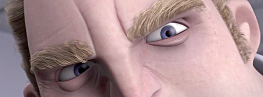
One of my favorite actors to look at for brow expressions is George Clooney (and let's face it, he's pretty easy on the eyes all around!). George has dark, prominent brows and his white scleras stand out against his dark skin, making for really clear, graphic expressions. He also has great comic timing, and when he's directed by the Coen Brothers you end up with some really entertaining performances, like this scene from "Intolerable Cruelty" (click picture to play movie):

See how clear his attitudes are and how the brow changes lead his turns. He actually does very few gestures and pose changes; most of the acting is in the brows, eyes and the angle of the head. I also love how the wrinkles in his forehead echo the shapes of his brows and emphasize the accents. Here are some choice frames:


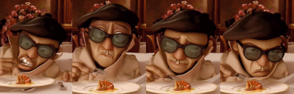
Animation tip: have your brow animation precede any head or body movement. Otherwise the brow action will be lost in the movement and the audience will miss it. This technique also helps to make the character look like he's thinking before he's acting.Below are some stills from a scene in Ratatouille (animated by Michal Makarewicz), in which the deposed chef Skinner tastes the titular dish. Skinner is largely hidden behind the table and his sunglasses, so his brows end up doing much of the acting. You can clearly see the sequence of his emotions in his brow: angry determination, surprise, ecstasy, and back to anger.
And here are some interesting behavioral facts about brows:
- As the pitch of the voice raises the brows go up
- As the pitch of the voice lowers, the brows likewise drop
- When asking a question where the answer is already known, the brows raise
- When asking a question where the answer is truly unknown, the brows lower
- Spontaneous facial expressions (surprise, fear, pain, etc.) tend to be symmetrical, where as expressions we choose to make (curiosity, suspicion, contempt, etc.) can be more asymmetrical.
I'm not going to break down all the muscles involved in brow animation, but I'd like to give special mention to the Corrugator muscle, which pulls the brows together in the middle and results in a tell-tale furrowing above the nose. This is important for intense expressions:
- Anger
- Fear
- Sadness
- Concentration
- Stress
- Disgust
- Deep thought
Note that you can't raise your brows and furrow them at the same time. You can raise the inner brows and furrow them, which gives a sad expression, and usually results in a twisted fleshy mass as the muscles pull the skin in different directions. It's a good idea to study facial anatomy to help you understand how the muscles of the face work. You don't have to memorize all the muscles' names (I haven't) but it will help you understand how to make more natural expressions and movements. It's also a good idea to study behavioral science to give you some insight into when, how and why humans make the faces they do. Here is some recommended reading on these topics:
The Artist's Complete Guide to Facial Expression by Gary Faigin
Unmasking the Face by Paul Eckman and Wallace Friesen
Manwatching by Desmond Morris
15 May, 2012
Animating 4 Legged Beasts ~ Gamasutra (Cathy Miller)
So I think I'm going to shift gears here and post something I've been wanting to do since Animation Mentor released it's Animals and Creatures class (click here for details). I have a couple of projects that I'm working on, but almost finished with. I want to work a funny dialogue animation then I really want to do a quadrupedal animation of some kind of animal. My buddy at work sent me this link and it's really intuitive. It's a bit lengthy, but has some really good stuff in it.
This post is from Gamasutra and was shared by Animator Cathy Feraday Miller .
Without further ado, here we go!
_________________________________________________________
Getting Started
With a media viewer that can scrub single-frame backwards and forwards, like QuickTime, you can watch the movement frame by frame. Drawing thumbnail images with directional notes helps you synthesize the information.There are now lots of websites out there that put up live-action animal footage, such as the Rhino House human and animal locomotion website, which has a built-in player that can scrub their video reference material (click the image below to check out their website and viewer). Thanks to the internet, finding reference and getting into it to see what is going on is the easy part. The hard part is converting that information into something that makes sense to the animator and for the character that is to be animated.
Following a process speeds up your workflow. Before I get into the creative part of animating, I usually have all of my research done. Gathering and absorbing all of the technical details and reference material beforehand frees me up to get into the creative flow of animating, with easy access to my reference material. My process is something like this:

1. Consider what animal most closely resembles the beast I need to animate.
2. Search for reference material. Here are the sources I find useful:
- Web:
- BBC http://www.bbc.co.uk/nature/animals/
- ARKive http://www.arkive.org/
- Eadweard Muybridge (books and web)
- Animal Motion Show DVDs and website
- Life drawing and observation
- Disney Animation The Illusion Of Life, Frank Thomas and Ollie Johnston, 1981
- Animal Locomotion, Eadweard Muybridge, 1887
- Video capture
4. Create thumbnail drawings to assist with my animation, including notes on direction and any unusual qualities I can see in footage.
5. Animate
The Four Gaits
In the course of my career, I've learned that there is a surprising similarity in how quadrupeds move, from species to species. Eadweard Muybridge's photographic works may be a century old, but they are still relevant and extremely useful.In his introduction to Animal Locomotion, he maintains that most quadrupeds -- be they dogs, cats, horses or rhinoceroses -- follow the same footfall pattern. This is the order in which the hooves or paws strike the ground while moving through the various gaits. Where they differ is in the flexibility of the spine. Visualize a rhino running, as opposed to a cheetah. The exceptions, according to Muybridge, are elephants, and animals like kangaroos.
The four speeds of movement, or the four "gaits", are shared amongst most four-legged animals. Almost every quadruped walks, trots, canters and gallops, and their legs move in the same manner when they do it.
As you can see in the image below, adapted from Muybridge's Animal Locomotion, the gaits have been broken down into symbols illustrating which leg strikes the ground in which order, assuming the animal is facing north with the right legs on the right and the left legs on the left.
For example, with the rotary gallop gait, if you start your cycle with the left rear foot striking the ground first, the next in sequence to hit the ground would be the right rear foot, then the right fore foot, followed by the left fore foot.
As for the transverse and rotary gallops, I've found the rotary gallop more often in reference material than the transverse, which I've mainly seen in horse footage. The canter is the roughest gait, with a lot of up-and-down movement. Elephants don't seem to follow these rules, and should be considered separately.
Once you get the legs moving roughly in the order that is appropriate, you can be creative with the rest of the body.

To save time, you could animate a "vanilla" gait cycle for each gait with the leg movements blocked in on keys and breakdowns only and the body and head having the rough up-and-down motion laid in on those keys. If using a universal rig, this file could then be exported onto any beast (with minimal adjustments, depending on the disparities of beast shape) and be used as a starting point for the animations.
Several different types or speeds of walks could also be created from this base file simply by playing with the amount of frames in the animation and the distance between the legs in the stride position or the distance the beast travels in the 'leap' part of the gallop.
The Walk
In the case of the walk gait, the rear left foot strikes first, followed by the left foreleg. The rear right leg strikes third, with the right foreleg falling last. The walk is the slowest gait, and is shared by all quadrupeds. Muybridge breaks down this information into a chart for the walk, trot, canter and gallop gaits in the introduction of Animal Locomotion. Converted into a graphic table, a walk cycle would look like this:
image adapted from: Animal Locomotion, Eadweard Muybridge, 1887

Image adapted from Horse Locomotion Walk 01, courtesy of www.rhinohouse.com (Click for larger image)

Adapted from Preston Blair, Animation, 1948

Animating A Walk
To illustrate this locomotion in 3D animation, I've roughed in a slow 40-frame walk cycle. Cycles must be symmetrical, or there will be a visible hitch in the walk, like a limp, or a hit in the animation.There are almost as many methods of animating as there are animators, but I prefer to approach posing as I would with 2D, or classical, animation. Posing out the whole character, rather than starting with the hips or isolating the lower body, and working on the entire character at once when creating the four major poses.

Details like toes and tails can be ignored or turned off at this stage. I create the four major keys or poses of the walk: two stride and two passing. I make them as symmetrical as possible, but they don't have to be mathematically the same.
There is an advantage to keying all major elements on the same frame. At this point, the keys can be slid around easily to change the timing of the walk. It is quick and easy to adapt and manipulate your cycle by figuring out your basic timing to the point where you start to add finishing details like overlap and follow-through. Keys arranged in an orderly fashion are really easy to manipulate in your 3D software package (here I am using the dope sheet in Maya 2011).
This is also the break off point where different kinds of walk cycles can be created now that the feet have been appropriately positioned. Variety can be added, like floppy overlap or stealthy sneak. The four basic poses can also be used as a starting point for other walks. You don't have to recreate the four basic key poses; you only have to adapt them to your specific purposes. Use the graph editor or tweak by hand, but remember to have each opposite pose match each other.


JoJo walk cycle, four keys only, with smooth spline interpolation. Watch the animation by clicking here.
There are several ways to fix errors like this but the easiest for me at this stage is to look at the graph editor and find out where there is a problem with the curve.


Note: flat tangents causing slowdown at apex of movement. (Click for larger image)

Grab spline handles and move them so that curve looks like it can cycle or repeat. (Click for larger image)

JoJo walk from side view, tail and toes added. Watch the animation by clicking here.
Walks and Runs: In Brief
Walks and runs can be considered a controlled fall with a little acceleration happening right after the passing position, which is similar to a push-off. As with all movement cycles, the forward or Z-translation would be non-linear.The speed of the walk is dictated by the length of the legs and how far apart the feet are planted in the stride position. There isn't really a moment where all four legs are off the ground, as in the other gaits, and the legs can only move so fast without looking "sped up". Conversely, the speed of gallop is largely determined by the shape and unique qualities of the beast. The faster you need the beast to go, the more flexible the spine will have to be, and the greater the squash and stretch. Look for this when watching reference. As the legs bunch up under the beast (the squash) energy is gathered, preparing for a "leap" or "stretch" where the animal can cover as much ground as its form, weight and strength allow. The tighter the squash, the more extended the stretch and the faster the beast can travel.
Variety in the weight or "attitude" of the walk, trot, or gallop can be achieved through the shape and movement in the spine and the amount of overlap and follow-through. The amount of flexibility and motion in the spine is key to defining the differences between a horse, a rhino, and a jungle cat.

Personality, the key ingredient in any good animation, comes not only from the shape of the key poses but also from what is happening in between the poses. How the character gets from stride to passing can define the character. Are they high-stepping? Straight forward and no-nonsense? Whimsical? Are they flopping around like a puppy or are they hard and densely muscled like a pit bull? The overlapping elements that you've added to the animation and their follow-through shows the audience who the character is and what it is made of.


Subscribe to:
Posts (Atom)